2017 is shaping up to be a year of contrasts with regards to interior trends and to illustrate let’s start with colour.
Benjamin Moore featured Simply White as the colour of the year in 2016 and now is touting ‘Shadow’ 2117-30 as their pick for 2017. At the opposite end of the spectrum, Shadow is billed as ‘allusive and enigmatic—a master of ambiance’—I find it dark and brooding.
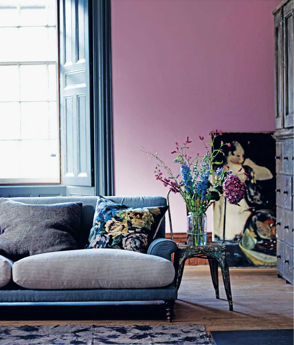
Last year Pantone couldn’t chose just one colour but elected for two—Rose Quartz and Serenity (soft pink with soft blue). For 2017 they really wouldn’t nail down a colour and have offered nine palettes with names for colours like Fandango Pink, Opaline Green and Orange Popsicle. All great accents to add to the monochromatic basics and I am thinking of retailers like Restoration Hardware which continues to show 50 shades of grey.

At the world’s largest furniture market in High Point, North Carolina, late October, the influences were very worldly and contrasting styles were everywhere. Still presented were lots of mid-century furniture pieces. Started in the 1920’s with the Bauhaus movement in Germany, migrated to the Scandinavian countries and went mod in Britain in the 60’s, modern styles were driven and influenced by great architects such as Brazilian architect Oscar Niemeyer, Israeli/Canadian architect Moshe Safdie (remember Habitat 67?), and German-American Ludwig Mies van der Rohe. The Modernist movement explored and experimented with new materials and techniques that were becoming available—whether used in the buildings or in furniture-making boundaries were stretched.
As if remembering that mid-century furniture could lack the cozy factor, we found some manufacturers at the High Point market over-compensating when they tried to add comfort to items such as sofas. Where the original 1960’s design had a slab of foam so hard you perched on the seat, by contrast, the new version of the same style was so soft you sunk down until you practically nibbled on your knees and needed a helping hand to get up. The Barcelona chair has elegant lines but it dictates how you will sit in it – same with all those teak based Scandinavian chairs – lovely sculptural shapes but you don’t curl up in one. I asked one furniture rep how long he expected the mid-century revival to last and his answer was a few more years as a main stay and then as an accent.
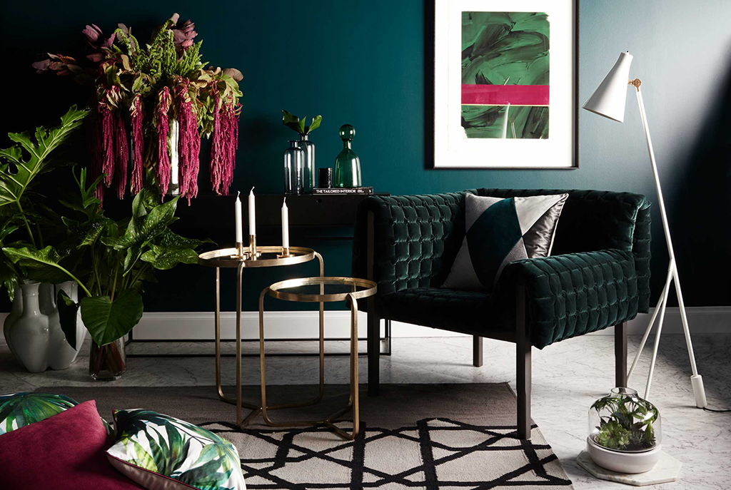
There were elements of mid-eastern design—a la Morocco or tres Tibetan—with interesting details and wood textures; pierced metal and forged grates —again the ‘rescued’ look showed everywhere. Rich colour and gorgeous fabrics excited the eye. Artisan and well travelled in feel—these pieces can add a humanizing touch to mid century modernism or fit in beautifully with Boho chic.
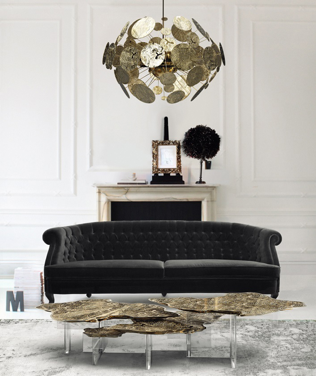
Industrial is still happening – it does suit the reclaimed factory loft condo to a tee – another example of architecture influencing interior design. There were also very classical pieces displayed against deconstructed walls for sublime contrast.
Artwork was large scale and great fun – turn of the century photos of buffalo in a giant format, bears were everywhere whether grizzlies, black bears or sleeping bears that were again in photographs or hand painted on rough wood.
My favourite wood for casegoods remains wormy maple – I find clear maple too perfect, almost boring. With a light driftwood stain the wormy maple has several shades that work equally well with other wood tones or into various greys complimenting anything nearby and connecting with nature.
Wood furniture featured several different construction methods – slatted like shutters, the ever present shaker; metered; inlaid; hobnailed; carved; curved; with dentil detail, and finished with great care or no care at all; limed; distressed, lacquered or painted. Again the metal workers were busy making fine bases and fixtures that showed Greek key designs and geodesic dome shapes.
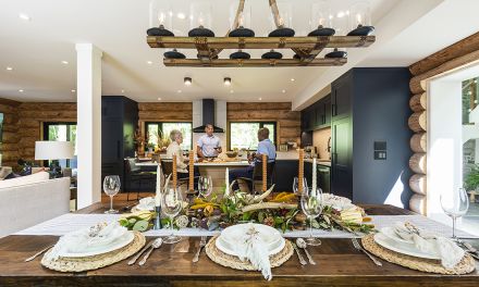
Cabin chic and California coastal décor was next to ultra mod or British upper crust. Symmetry is back with matching night stands or bookcases flanking matching end tables either side of a sofa. Contrasts, whether through the use of colour, materials or styles adds interest.
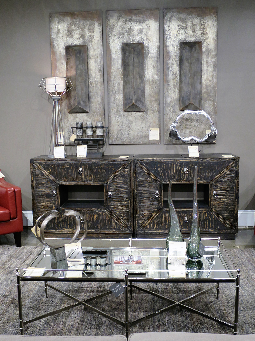
We loved the Uttermost vignette featuring a pair of Italian leather club chairs in vivid teal with a small martini table all placed in front of an over- scaled painting of waves. Several furniture companies are adding a more refined, better quality, almost classical line to their regular stylings. One example is the Revelation collection by Uttermost.
So what is trending for 2017? Well, just about everything and anything. Feel free to mix and match. Don’t hesitate to use matching end tables, for example, to achieve some symmetry because it helps create balance and keep chaos at bay. I remain a proponent of injecting colour but use one that you personally like (checking out your closet or favourite piece of art usually reveals one or in the case of Pantone, nine). Still keep the large pieces neutral for versatility. Don’t be seduced just by good looks—opt for function and comfort too.
Enjoy life—furnish well. |E|

