86
|
AUTUMN
|
EARLY WINTER
2016
Artwork issomething thatspeaks
to to the individual
and can be the basis of a room’s design—setting the palette, a
themeor amood. “Theprinciples of trueart is not toportraybut
toevoke”— JerzyKosinski.
Personally I likeahuge rangeof stylesbutmy favouritepiecesare
winter landscapes. Think of the sun just risingand the colours of
washed,prettypastelsand icecream flavours likeorangesherbet
and vanilla cream groundedwith inky black and blue back-lit
trees. I haveanoriginal oil onboardby local artist RobertKemp,
another is fromBill Franks ‘October Snowfall’ collectionand the
last isagarage sale find that cost$25. I like themall equallyand
oneof thesedays theywill behungasacollection ina room that
isdesignedaround them.
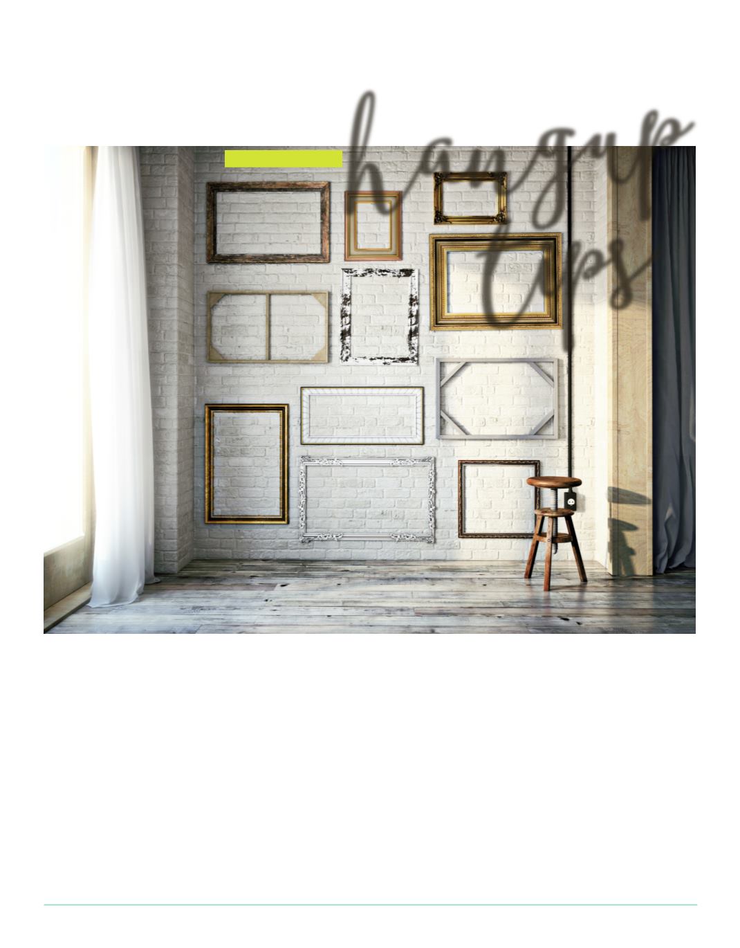
Speakingofhangingartworkherearesomeguidelinesand tricks
when itcomes towallsandart–mostarecommonsenseandwhat
works for ‘theeye’.
Galleriesgenerallyplaceart so the focal point is eye levelwhen
standing—whichworks for largerpiecesbutones thatare less than
say two feet square look like theyare floatingon thewall. Smaller
piecesbenefit fromcompositions—placing themwithother similar
worksorarrangedoverapieceof furnitureandanchoredwitha
lamp toone sideormaybecandle sticks.
Not surehow toachieve the right composition? Try takingphotos
ofyourpieces- from thesamedistance tokeep thescale—cuteach
out andplace themongraphpaper—playarounduntil your eyes
feel comfortable.
hangup
tips
Words | Sharon Allan
artful starts


