A BIG
GIRL’S
ROOM
48
Escarpment Magazine Spring 2014
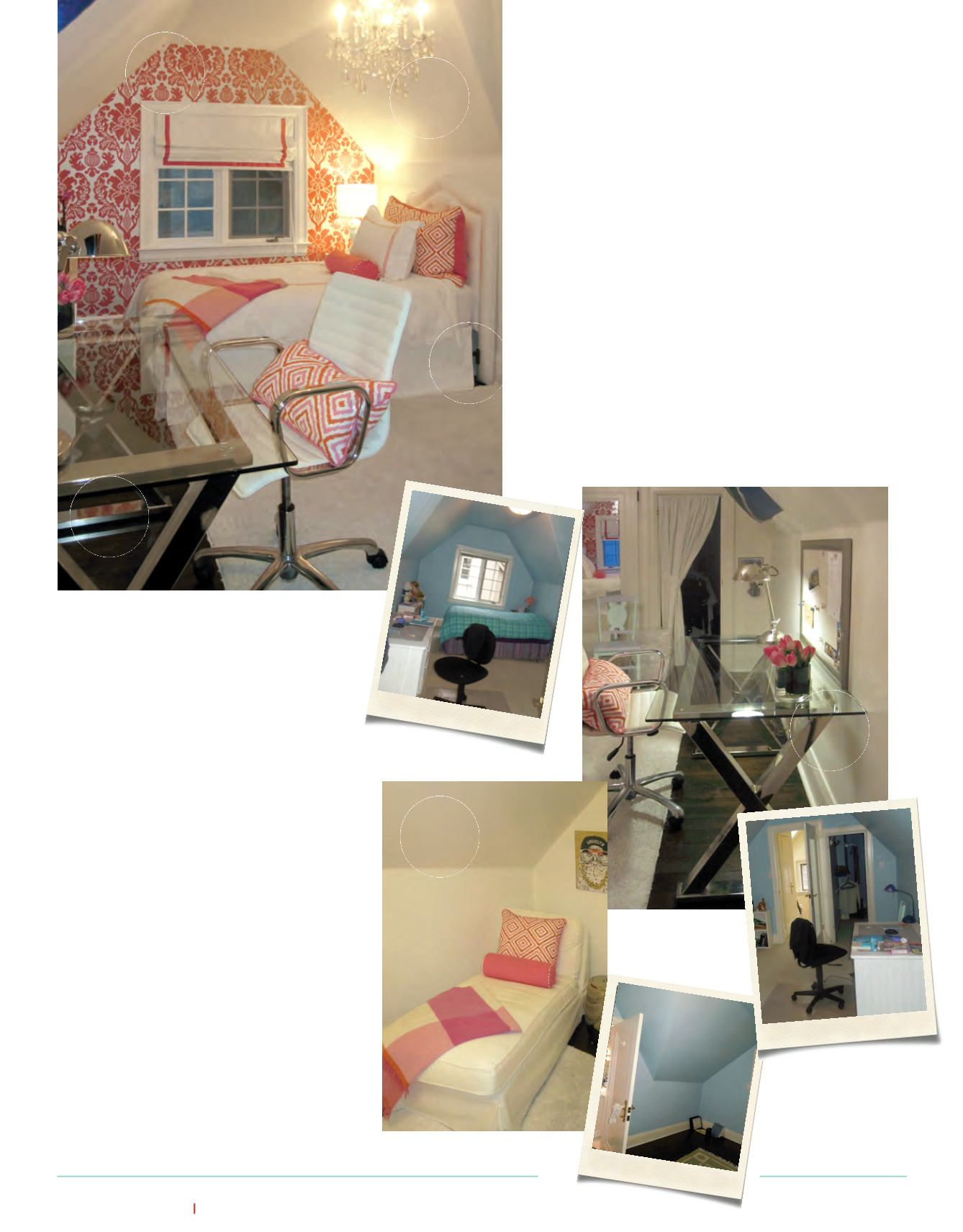
This make-over project involved a total transformation of an attic bedroom
into a warm, cozy space suitable for a teenaged girl. Dealing with an A-
frame structure such as this can have its pitfalls. Luckily there are design
tricks to help challenging spaces feel inviting.
byMeghanMolloy
bedroom before
wasted corner before
1.
Usepatterns to trick theeye into seeingdepth.
Here, a silver foil-flocked, damaskwallpaperdraws
theeye to the far endof the room.Changing thewalls
towhiteallows them to float upward.
2.
The soliddeskwas swapped fora sleek, glass
topdesk, allowing theeye see through the furniture,
keeping the spaceunclutteredandopen.
3.
Wastedcorners, too small to standupright in,
makeaperfect readingnookwith theadditionof a
chaise lounge.
4.
Reflectiveaccentssuch thechromedeskand lamp,
encourage theeye tokeepmoving.
5.
Don’t let lowceilings intimdateyou intoopting
fora flushmount light fixture. This crystal chandelier
dangles into the roomcreatingevenmoredivision
anddepth.
6.
Anoversizedkingpillow sham fitsperfectly
acrossa twinbed.
7.
Limit your colourpalateand repeat colours to
connect the room’selements.
|E|
1
2
3
4
6
5
ESCARPMENT
®
HOME
|
designer tips & tricks
desk before
Contact Interior Designer,
MeghanMolloyat


